Creating one, with shades makes the drawings look more convincing. The use of tone in drawings arose after the lines drawings. In Pompeii, frescoes have a total area that gives forms and figures to the subjects. It helps the artist to express the subjects in different forms.
When tones are established on a line drawing, it sends a message that the object is occupying space. Finer the grading the more readily eyes will convince. If tones will be so smooth, we will be convinced that those subjects must be present somewhere. It affects the brain to conceive that there must have been some time when it was drawn from some object.
At present, it is not difficult to reproduce objects, architects, or people accurately. But at the start of the Renaissance period, it was difficult to create and harder to convince the people about the depth of the field. Tonality with time played a very important role in creating the subjects with the proper depth and curve.
Vittorre Carpaccio (1472-1526)
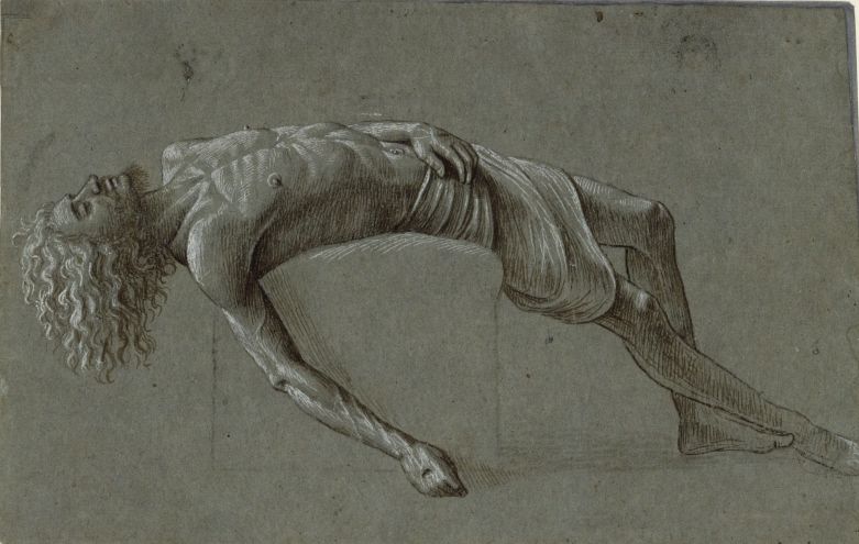
Tone, light, and shadow play a very important role in convincing the viewers that the object which is drawn is three-dimensional. Earlier attempts were effective but with time they got better. In Carpaccio’s drawings – small marks of white chalk pick out the garments of the subjects. Dark chalk is also used similarly. The medium tone of the paper becomes a solid body with bright lights falling on the paper.
The darker tones are giving weight as well as an outline to the subject.
Giovanni Francesco Barbieri (1591-1666)

The vigorous naturalism of his early manner contrasts with the classical equilibrium of his later works. His many drawings are noted for their luminosity and lively style. He was influenced by the drama of artists like Caravaggio.
His even strokes on the facial surface build texture of darker tones. Coarser texture on the hair gives a different feel from the smooth skin. He puts strong marks from the different directions to help in emphasizing the form of the subject.
The line drawings on the eyes, nostrils, and lips are drawn with the strongest marks. He used the power of tone to create convincing eyes with the reality in it.
Peter Ilsted (1861 –1933)

He was most associated with domestic interior scenes. His works show strong sunlight although the light source is not shown it is clear from the broad space behind the chair that it is coming out of some large windows.
Tones of drawing blend in a very subtle way. Tone blending in the drawing is smooth as well as light contrasting the artist we have studied earlier.
Andrew Wyeth (1917-2009)
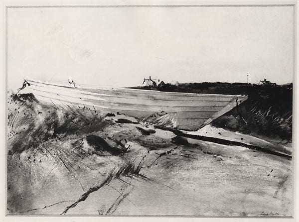
Wyeth was an American visual artist, primarily a realist painter, working predominantly in a regionalist style. He was one of the best-known U.S. artists of the middle 20th century.
The artist use tones to create an infinite field in the outer still life of a larger scene. His compositions indicate a much larger world in view. His works on still life drawings and paintings are considered outstanding.
Claude Lorrain (1600-1682)
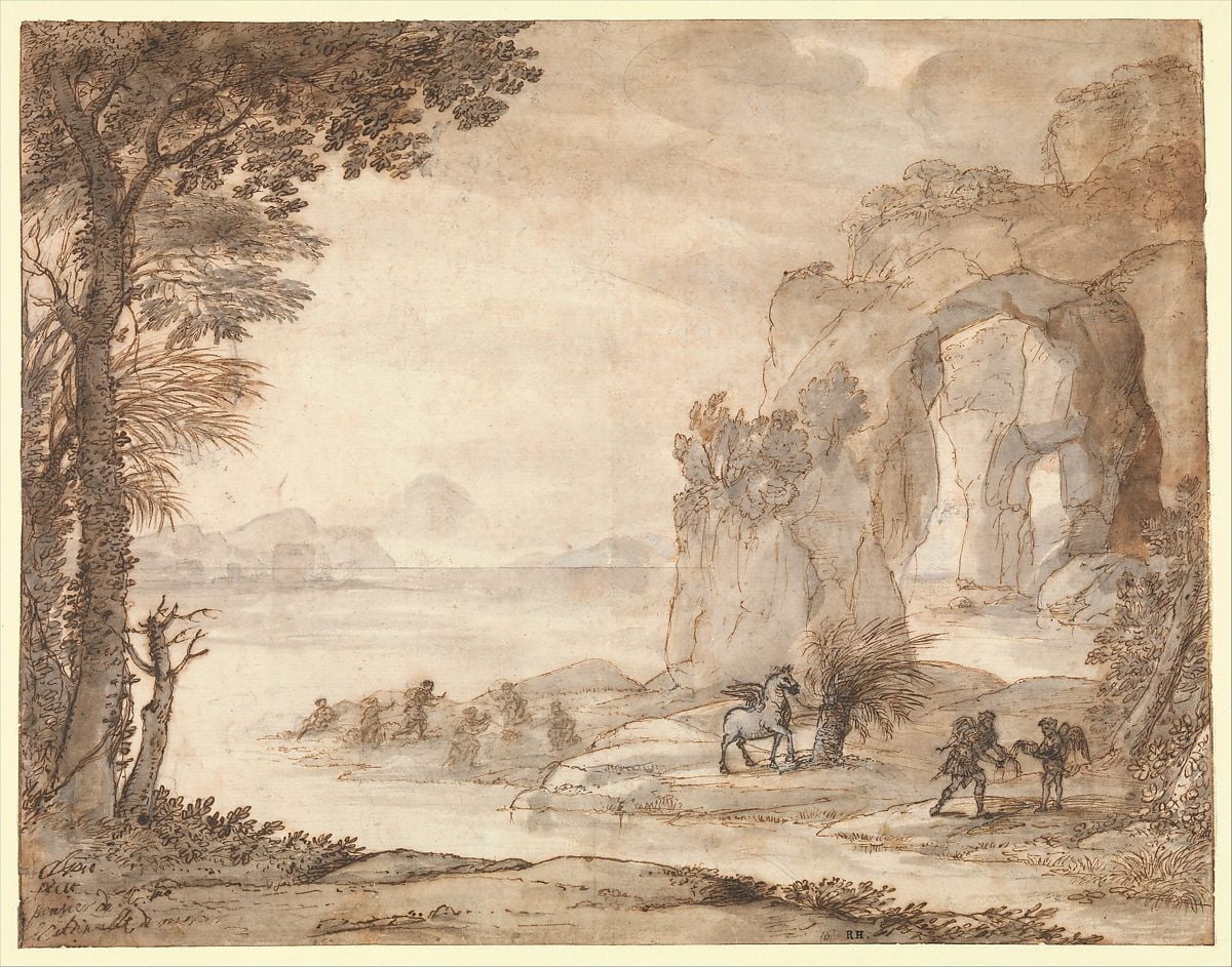
He was a French painter, draughtsman, and etcher of the Baroque era. He spent most of his life in Italy, and is one of the earliest important artists, apart from his contemporaries in Dutch Golden Age painting, to concentrate on landscape painting. His landscapes are usually turned into the more prestigious genre of history paintings by the addition of a few small figures, typically representing a scene from the Bible or classical mythology.
He used detailed oriented landscapes in his paintings and drawings. In his landscape drawings, foreground and middle ground are almost non-existent. His works are concentrated on the smaller part of the landscapes.
While drawing leaves he creates darker marks on them to show the shapes of leaves and twigs. He uses multiple tones where some areas could be very dark showing no light falling on the surface while some areas are untouched showing the particular area is getting too much sunlight.
Giovanni Antonio Canal (Canaletto) (1697-1768)
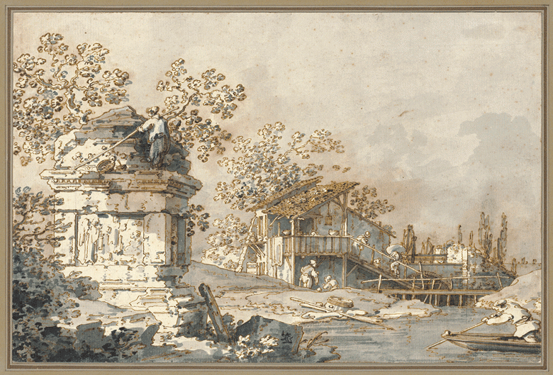
He was an Italian painter from the Republic of Venice, considered an important member of the 18th-century Venetian school. It is quite easy for the new artists to get confused from the textures Canal use. But he uses the golden rule of landscape – putting the main shape of the buildings first. The repetition of the architectural details should be kept uniform otherwise it looks like the buildings are collapsing.
Never try to create every detail of the buildings. It will make it odd in the long run. Canaletto used horizontal lines as the shadows of the building in the water. The skies above the buildings are slightly shaded to provide contrast and definition.
Henri Le Sidaner (1862-1939)

Henri Le Sidaner was a contemporary of the Post-impressionists, was an intimate painter known for his paintings of domestic interiors and quiet street scenes. His style contained elements of impressionism.
His still life shows a connection with the outside world as well as interiors. His artwork shows tonal variations, using a textured approach. They contain deeper tones in shades as well as the main tone. High contrast drawings with the perfect blend of tones in his artworks create almost dream-like images. They seem to be in the presence of very high sunlight.
Claude Lorrain
When we study the artworks of Claude Lorrain, we see that he used very few small speckles of the pen near the horizon. His sketch contains no detailed objects from the horizon the foreground to the middle. The tonal areas are the indications of distances such as pale tone in the distance scene, darkest in the middle, light in the foremost side covered by the darker tone.
He did not even try to draw trees, hills, or water bodies in his landscape drawings but the different layers of tones helped him to create the one with or without any intention.
When we study his drawing of a tree we get to know about his techniques. The works are created with a low economy and great feelings. He doesn’t try to make every leaf of the tree instead he draws some interesting blob and scrawls that subtly suggest the leafy canopy.
With heavy tones, he created the larger areas with fewer details. He created some dark areas as well as described the branches as well as some clumps of leaves.
Giovanni Battista Tiepolo (1692-1770)
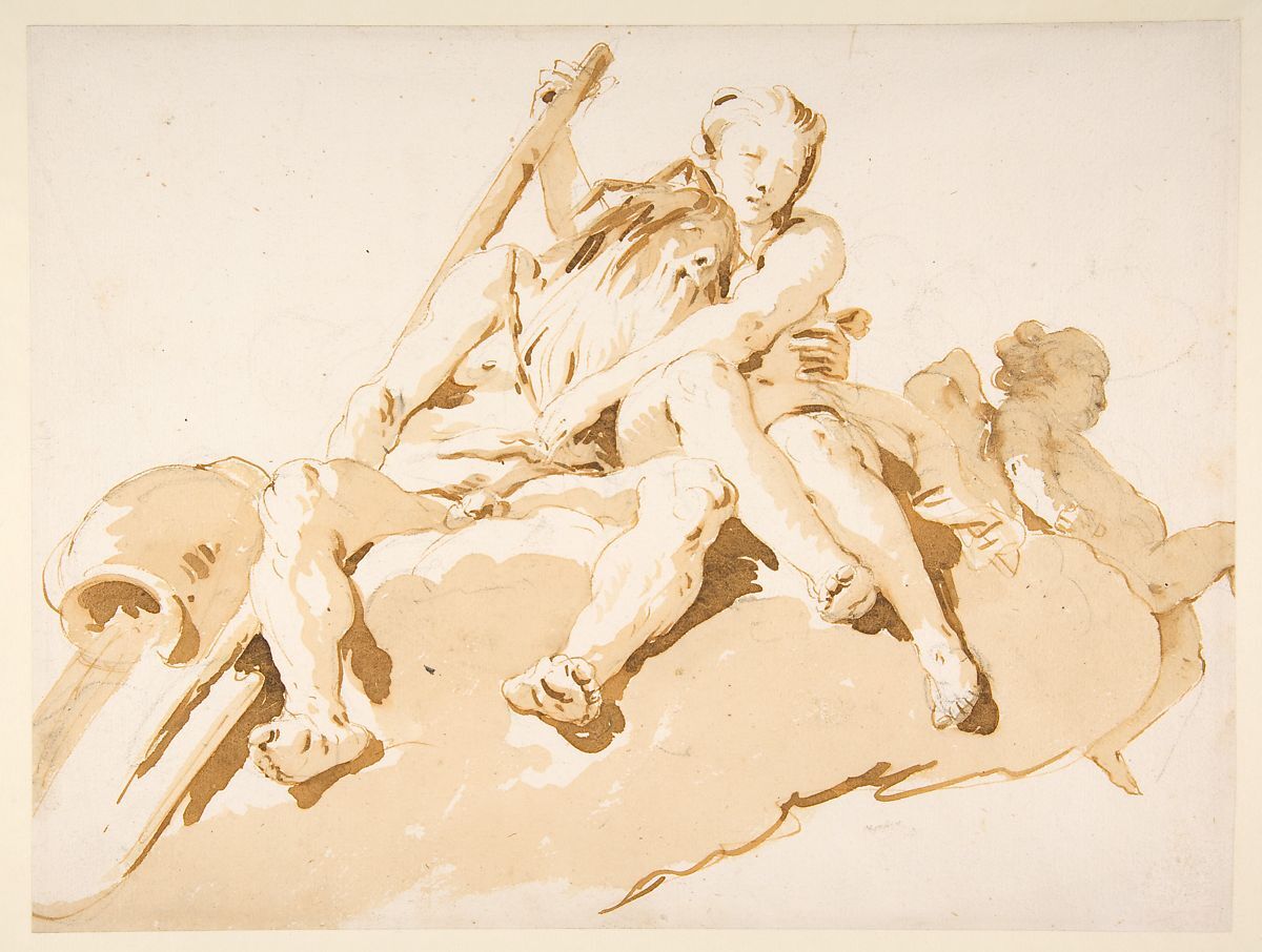
He is known for the painted wall and ceilings. Created his works with loose scrawling lines with splashes to give the solidity. He uses his drawings as the pre-stage of his paintings which is why we can see the amalgam of both in one medium.
There are basically three tones in his drawings, the lines that show and define the shapes. The light tonal for the shadows and deep tone show a figure silhouetted against the light.
Antoine Watteau (1684-1721)
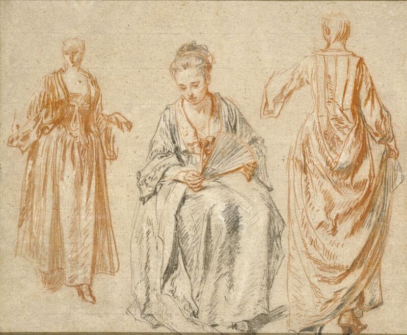
He used dark outlines to emphasize the figure and limbs of subjects as well as to show light on the face. Using toned paper makes white chalks more effective. The art structure and tone are similar to the drawings of Carpaccio.
Antoine used the toned papers with dark and white chalks. It helped him to draw with the minimal lines but the efforts were of course increased. He got the confidence to make looser and softer-edged drawings.
Leonardo da Vinci (1459-1519)
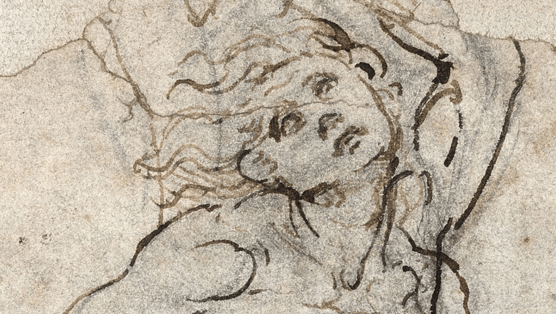
Leonardo ad Vinci’s drawings are technically and visually superior to any artist who works in three-dimensional drawings. He did not only see the details more clearly but draw them more efficiently as well.
Soft textures, multiple marks, and sharply defined parts are good to give a three-dimensional impression of the surface. The dimensional effects could also be achieved through the closely drawn lines. There is an elegance in the way Leonardo put tones on the shapes of his subjects. They are neither too less or too much. The perfect amount of tone gives the perfect picture.
Jean-Auguste-Dominique Ingres (1780-1867)

He was a French neo-classical painter. Popular for his draughtsman-ship, he got wonderful precisions in his drawings. His unfinished drawings are also perfect due to their unusual precision. He used camera lucida (A camera lucida is an optical device used as a drawing aid by artists and microscopists.) extensively. Beautiful modulated tonal shades in his drawings created an effect that looks like a real photograph.
The subjects are drawn in a still manner that seems like they are captured in that exact moment from eternity. His works are the result of unlimited patience and stainless steel-like determination.
Creating work like Jean required endless patience and a lot of practice. The drawing lines and tones are near perfection. The symmetry and emotional depths in the subjects’ faces are undoubtedly unparallel.
John Ward (1917-2007)
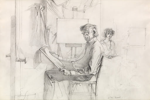
He was an art illustrator, painter, and 20th-century figurative artist. He created wonderful figurative drawings with great tones and exact lines. He was a master in creating portraits and maybe this was the reason he was commissioned from the royal family of Britain and celebrities.
He used hatching for the tone that itself a classical way of creating a tonal area on the subject. Lines on the right direction on the right place of a face. It indeed gives a livelier feeling as well as an illusion of three dimensions.
David Hockney
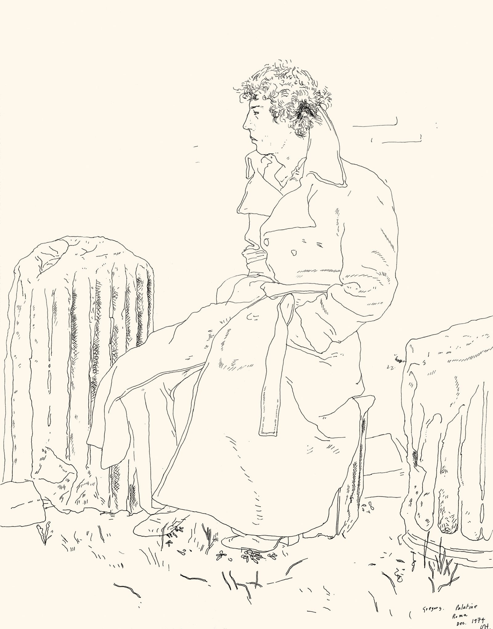
He is a painter, draftsman, printmaker, photographer, and designer from England. He uses a similar technique as John Ward but with a softer texture. It helps the viewers to get the close-up looks of the face of subjects with less focus.
Dimensional effects in the drawings are created from the random lines moving straight in any specific direction. His works on his portraits are considerably fine and informative for the art classes and art students.
Pablo Picasso

Here, we can see the drawing and tones of Picasso’s subjects are quite different from subject to subject. In some cases, he drew portraits with wavy lines over it. It almost looks like, he intentionally draws those lines on the simple portraits for gaining dimensions.
In this kind of portrait, each line helps the viewers to conclude the shape’s structure. This specific method is very effective although it needs precision and mastery in creating tones from the random lines and at the same time contrary to other artists he doesn’t seem economical with his lines.
On the other hand, we also see his drawings with the fixes statue-like expressions (Where) he had used blotty inks on the faces that don’t show any kind of emotions or movements.
These types of drawings are extremely economical. The solid feeling on the face gives somewhat masculine and straight emotions. This feeling of solidity without emotions is something experimental and practical as well.
Henry Carr (1894-1970)

He was one of the most successful British landscape and portrait painters who served as a war artist in WWII. He produced some of the best-quality portraits of his time due to his ability to create portraits of people according to their quality.
The results of his drawings were expressive, subtle, and sensitive at the same time precise in nature.
He was also an art teacher, it helps the students to learn to communicate through the drawing tones and structure efficiently.
Pierre-Paul Prud’hon (1758-1823)
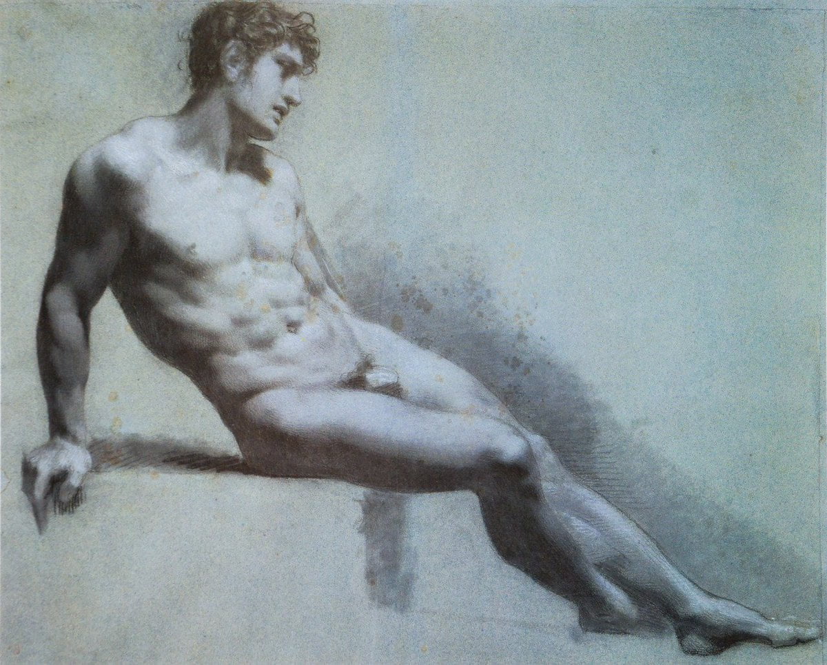
He was the French neo-classicist, master on toned paper. He used both light and dark tones to suggest forms in subjects. The marks in his drawings were created from both white and dark chalk that helps to create an impressionistic flavor in the drawings.
The mark lines are small and they go in all directions. This almost disappears in the toned papers. This also helps him to make an illusion of light and dark over the subjects as well as convey the emotions in the body.
The unfocused nature of lines creates scribbled marks in all directions.

Vikash Kalra is a self-taught artist & writer based in New Delhi whose work has been exhibited across India and is held in several private and corporate collections.
https://www.vikashkalra.com/web/
Leave a Reply